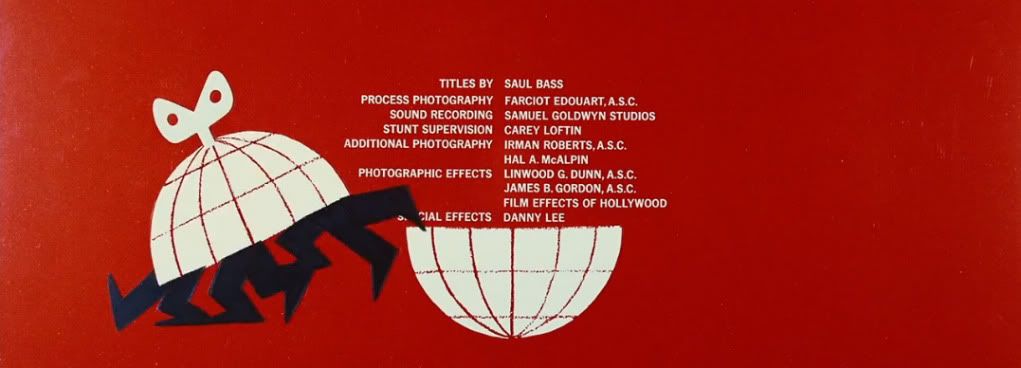
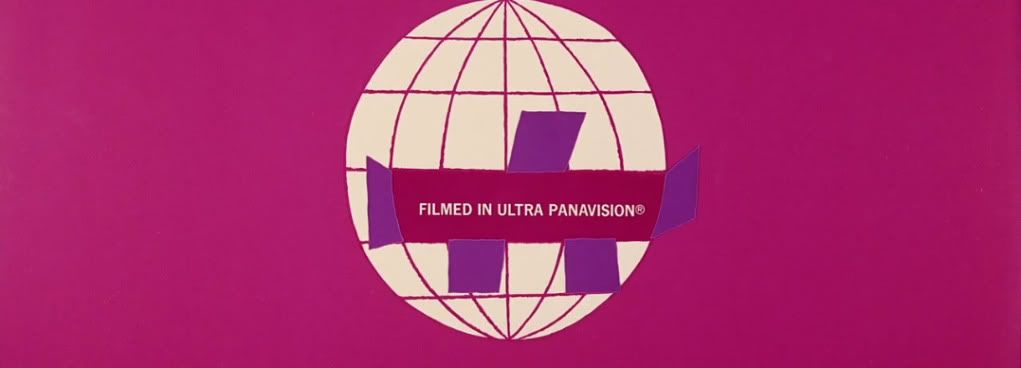
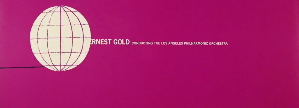
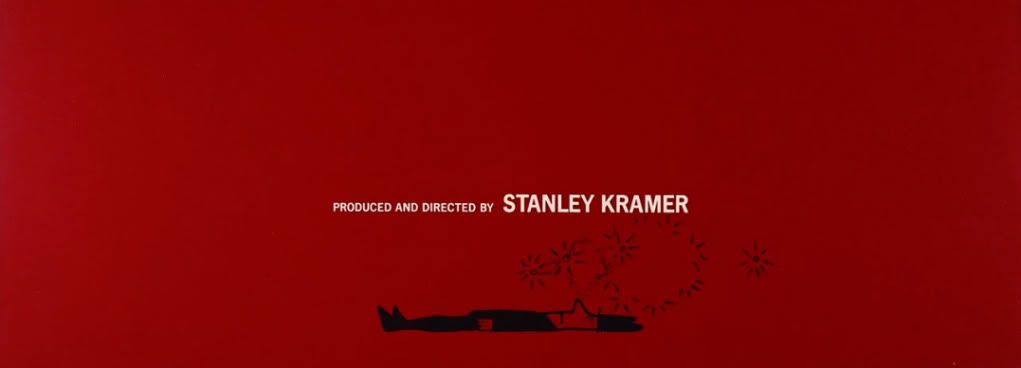
Watch it here at...
http://www.artofthetitle.com/title/its-a-mad-mad-mad-mad-world/
Many pre-digital works are better conceived and executed
than today's more technologically fluid work. Making
visuals with real world materials meant the idea behind the vision was stripped
of unnecessary and difficult to do fluff, making the end result clear and strong.
It's akin to how a
very simple set of painted flats filmed with two locked down cameras somehow
looks more together visually than the million dollar staging of event shows
like IDOL. Typically today's sets are a dazzling jumbo-tron multi spot lit combo crowning the show's logo, the camera's swoop and glide where they please, all up in the performers space taking in
everything from warped angles. The end result has nothing to do with the artist and everything to do with
branding a performance to a franchise.
 | ||||||||
| 60's STRONG |
 | ||||
| But what's going on here? |
Performers become iconic against pure backdrops and crisp
art direction, they are lost among noisy clutter and a wealth of camera
positions. This applies to an idea, how it can drown in a soup of cleverness, or
be over shadowed by the slick trickery of presentation. With less and less
limitations on our creativity, we should start setting our own, if only to
clarify what it is we are trying to say.


